Car IQ - Design System
Constructing a scalable fleet payment design system
Client
Car IQ
Project
Design system
Duration
6 months
Team
2 UX designers,
1 product manager
My role
Design system, illustrations, visual design
Overview
Background
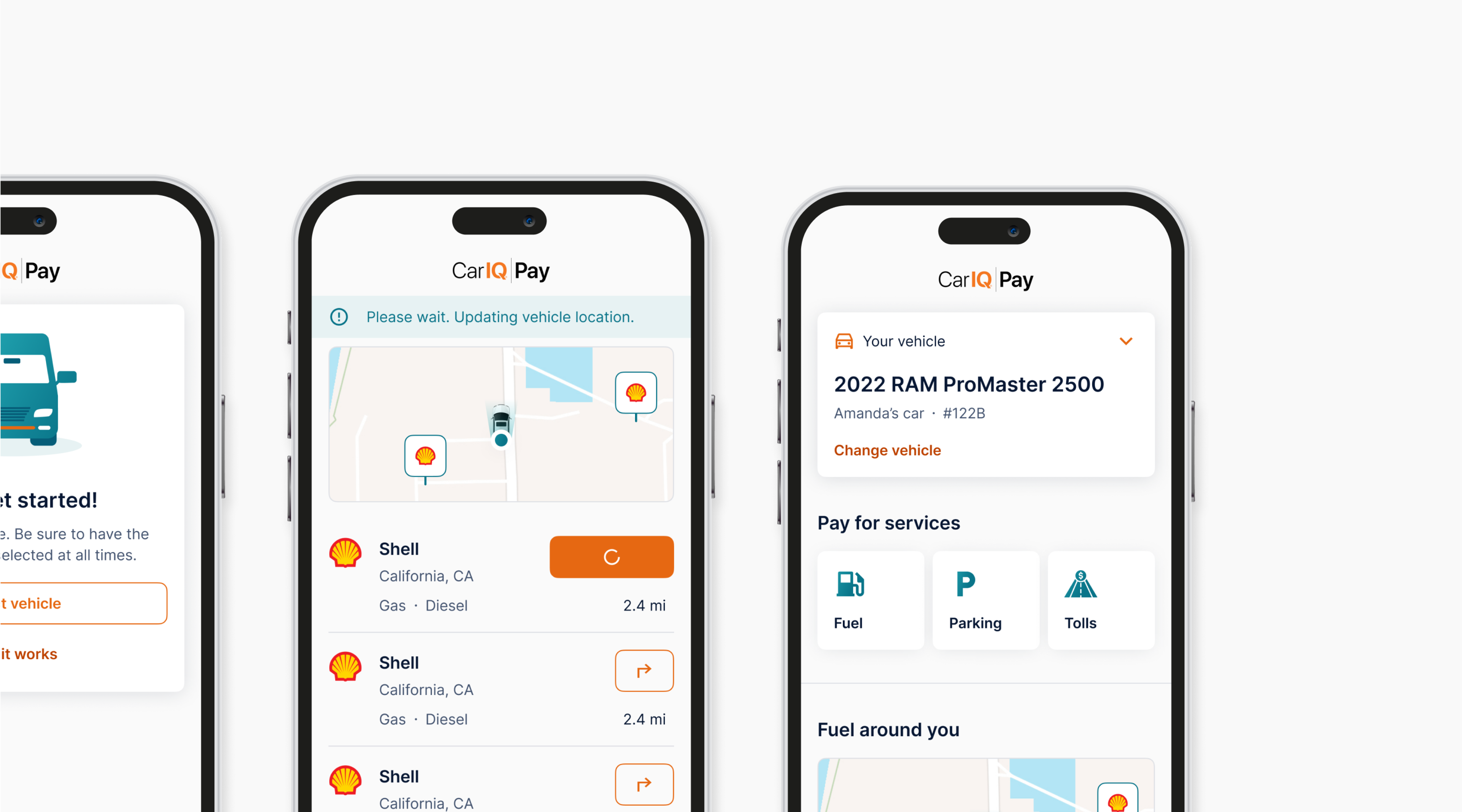
Car IQ is a payment solution for vehicles and fleets created to enable vehicles to transact securely. For this project, they wanted to redesign the look and feel of their mobile products. My initial thought was that just because users are using the product for unglamorous things like managing payments and car services, doesn’t mean the product needs to be cut-and-dry.
The existing Car IQ products and design system also lacked brand recognition and consistency. Internally, there wasn’t clear alignment across departments, delaying feature updates and hindering effective teamwork. As the company evolved, it needed a design system that would scale alongside its growing product and brand.
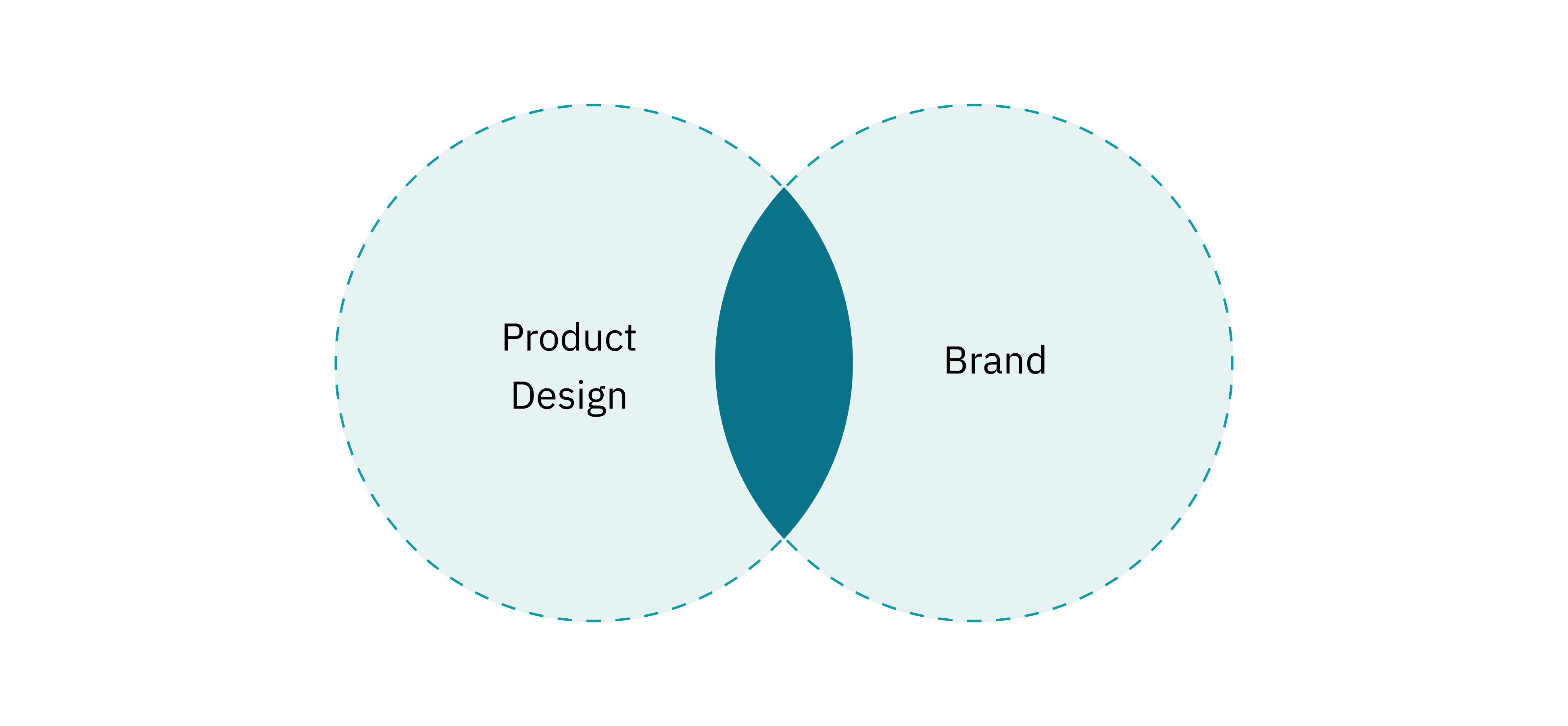
With other designers on the team, I spruced up the Car IQ brand and helped to create an efficient design system for collaboration and product scaling.
Goals
Style and component library
Create a “here’s-where-everything-is” for all of Car IQ’s mobile and desktop products.
Brand recognition
Align Car IQ’s marketing + brand visuals with those of their products.
Development handoff process
Establish a proper designer to developer handoff process.
The Shiny New System
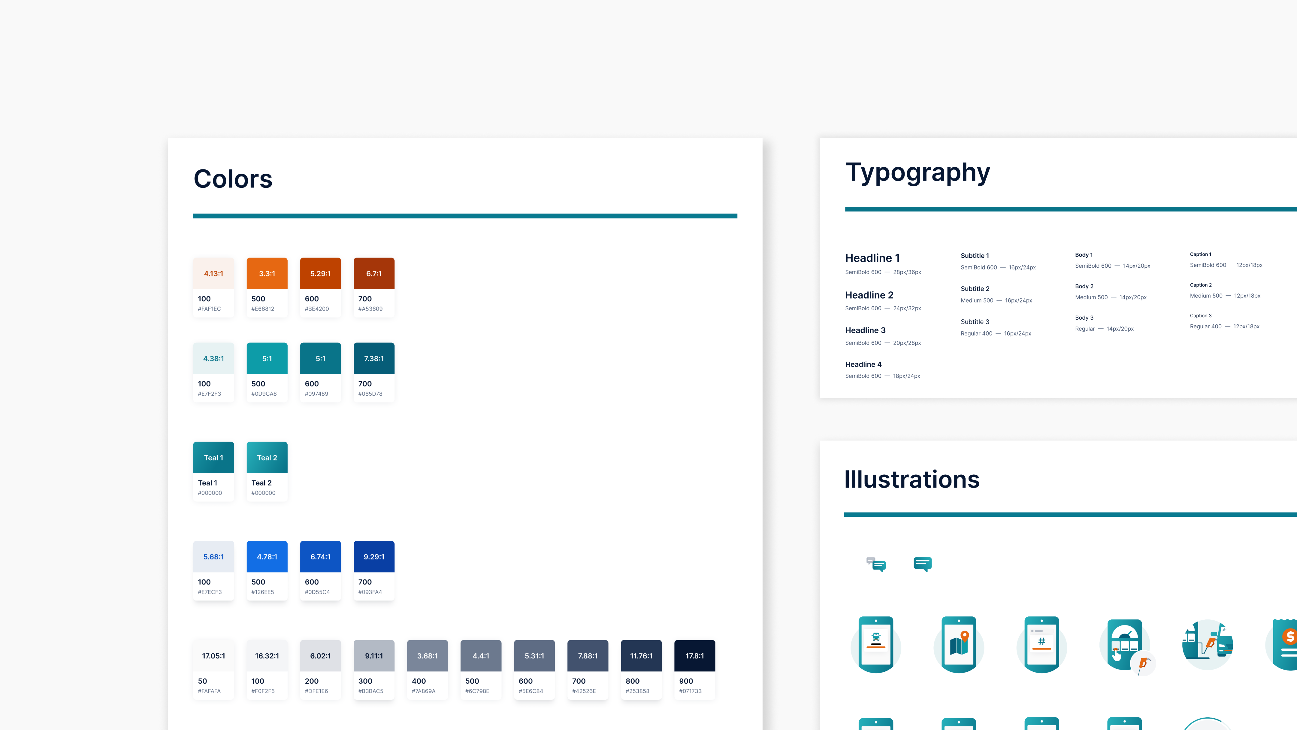
Typeface and colors
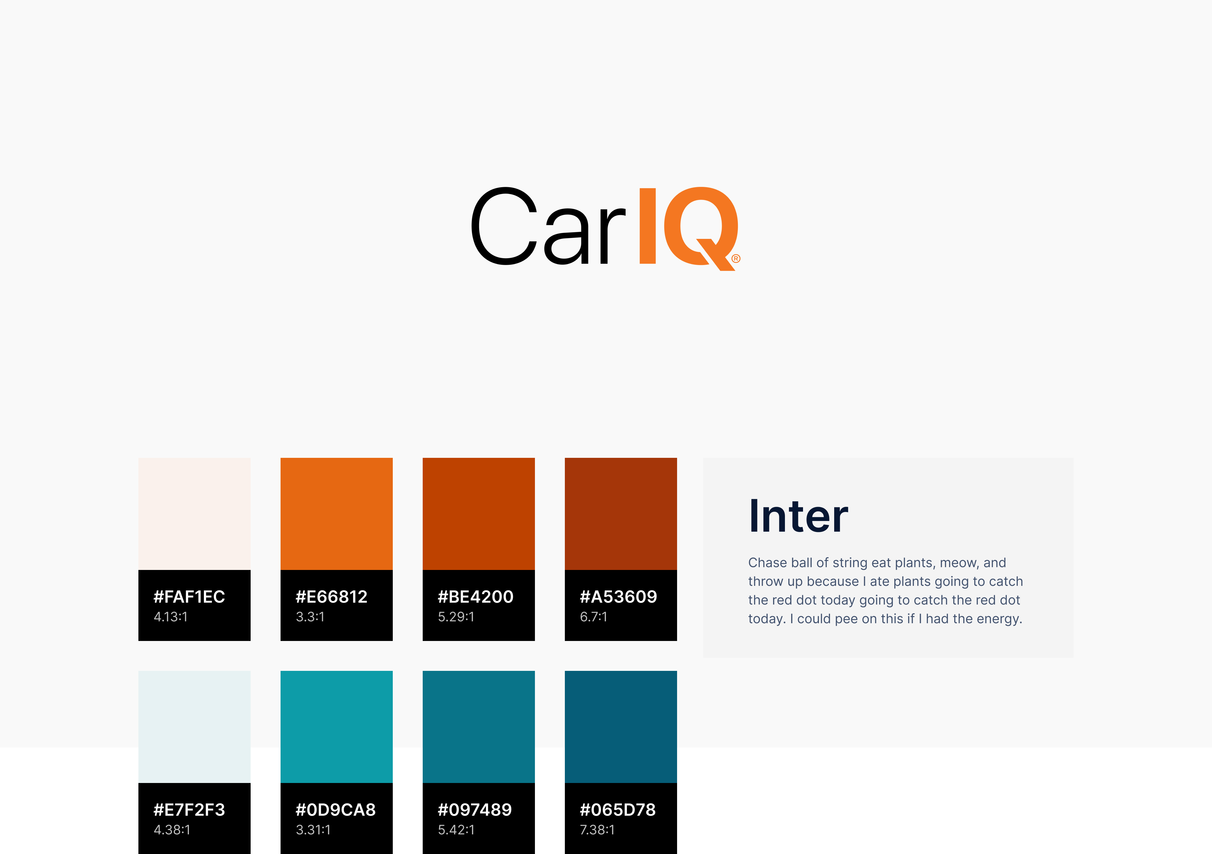
Since Car IQ works primarily with other businesses, I aimed to give the brand a professional but also modern feel. The result? A refreshing update with a straightforward typeface and a vibrant, accessible color palette.
Car IQ color, type, and logo
Illustrations
Even though tasks like making payments for fuel and parking can be rather banal, I developed clean and crisp illustrations to bring much needed vitality to the brand.
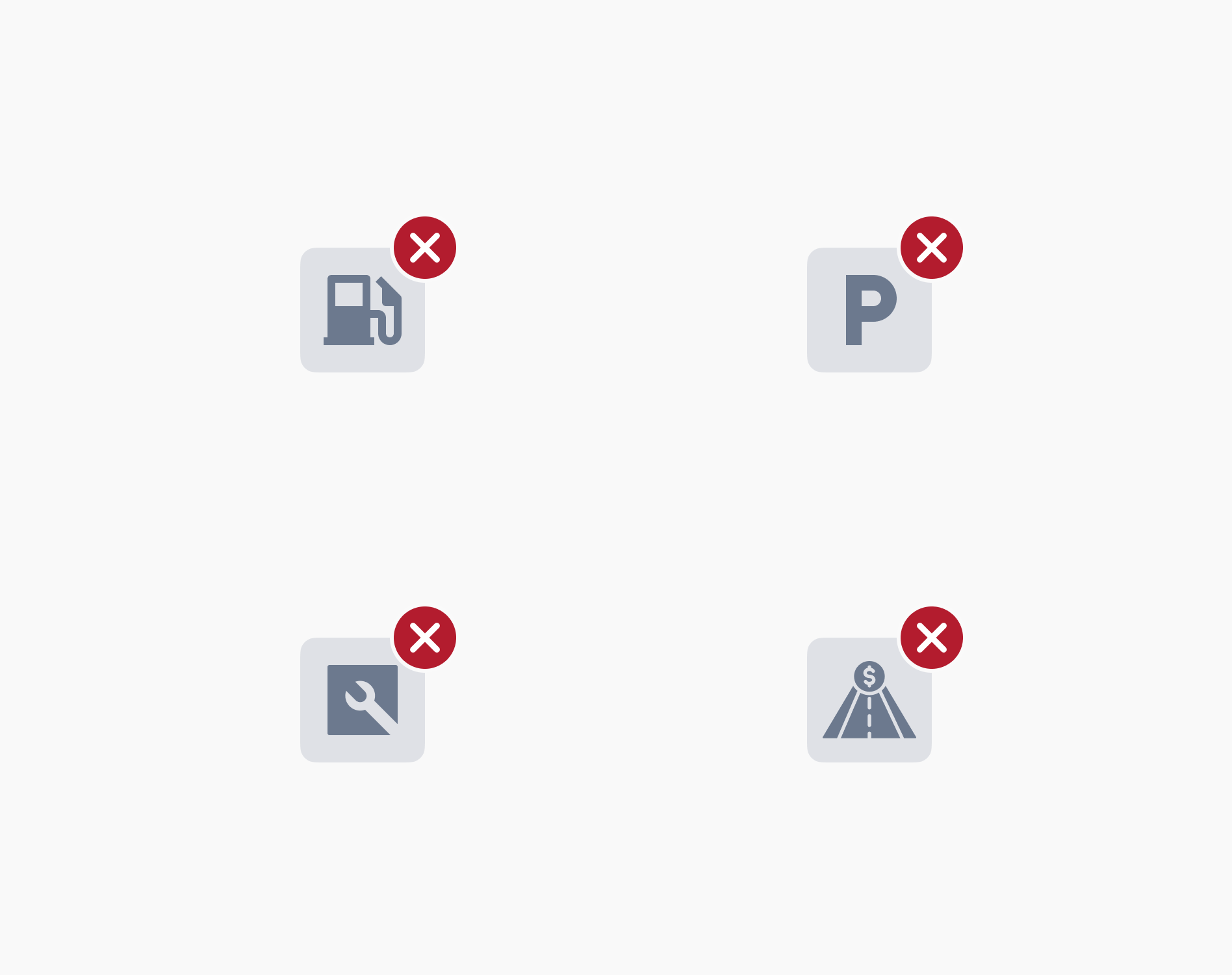
Unavailable service illustrations
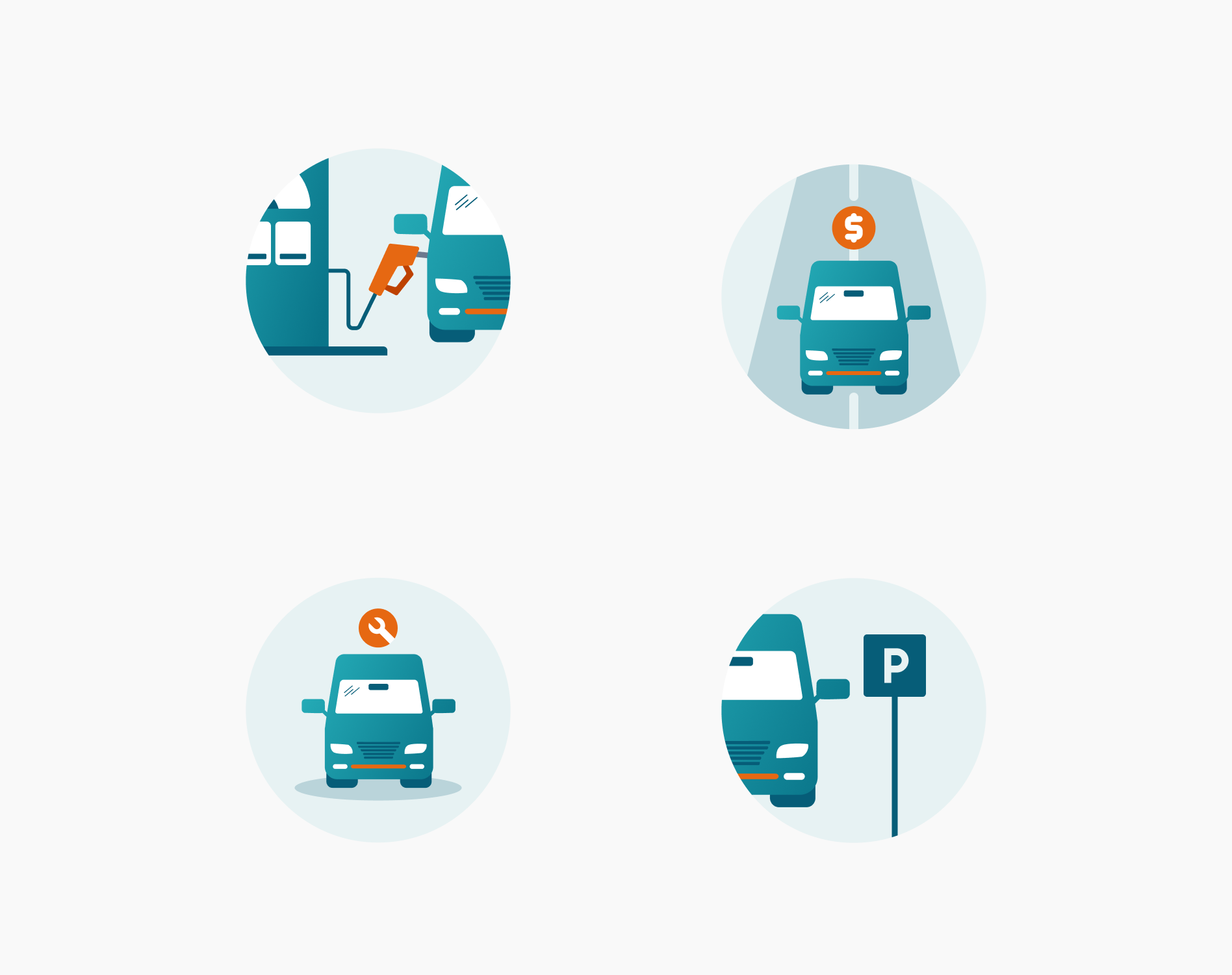
Service illustrations

Error illustrations
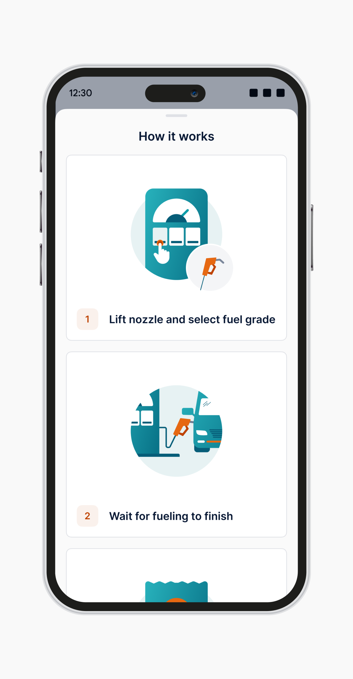
How to fuel screen
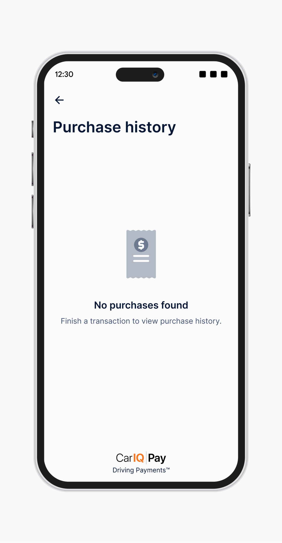
No purchase found screen
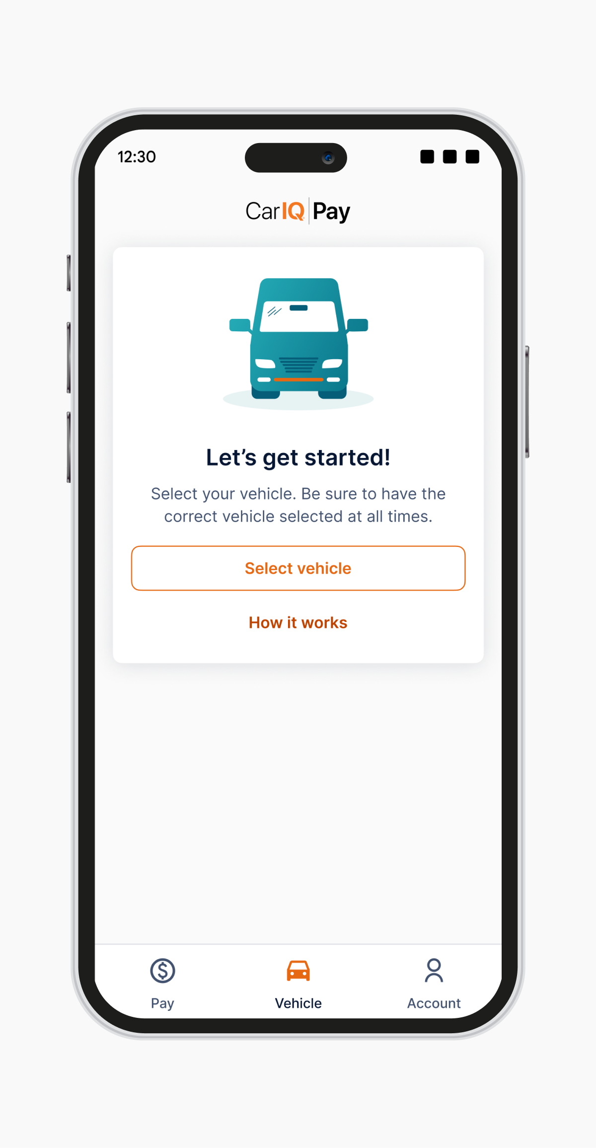
Setup screen
Patterns, everywhere
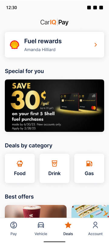
We set a systematic pattern across all the components and screens so all the visuals are consistent across their products.
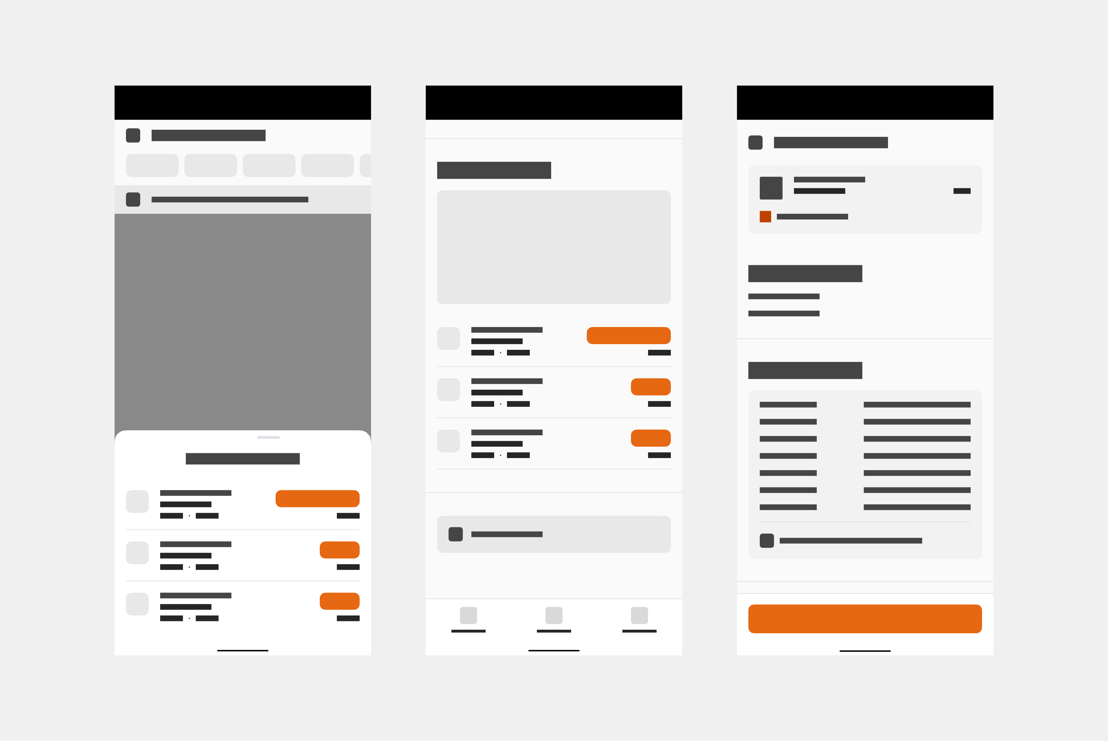
Patterns for Car IQ
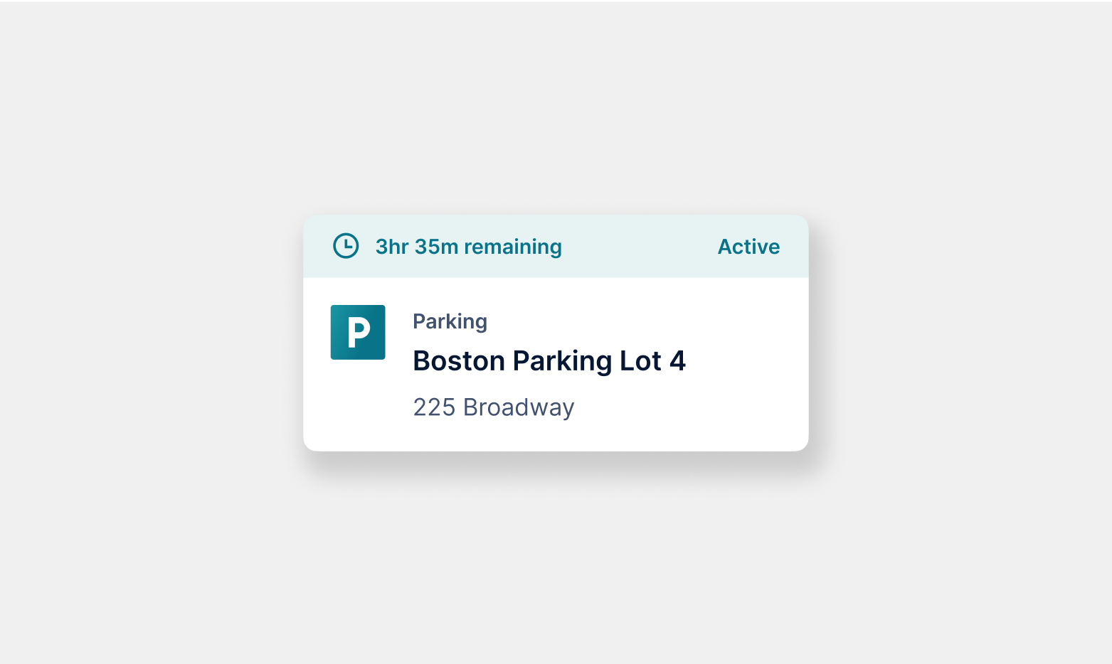
Parking card
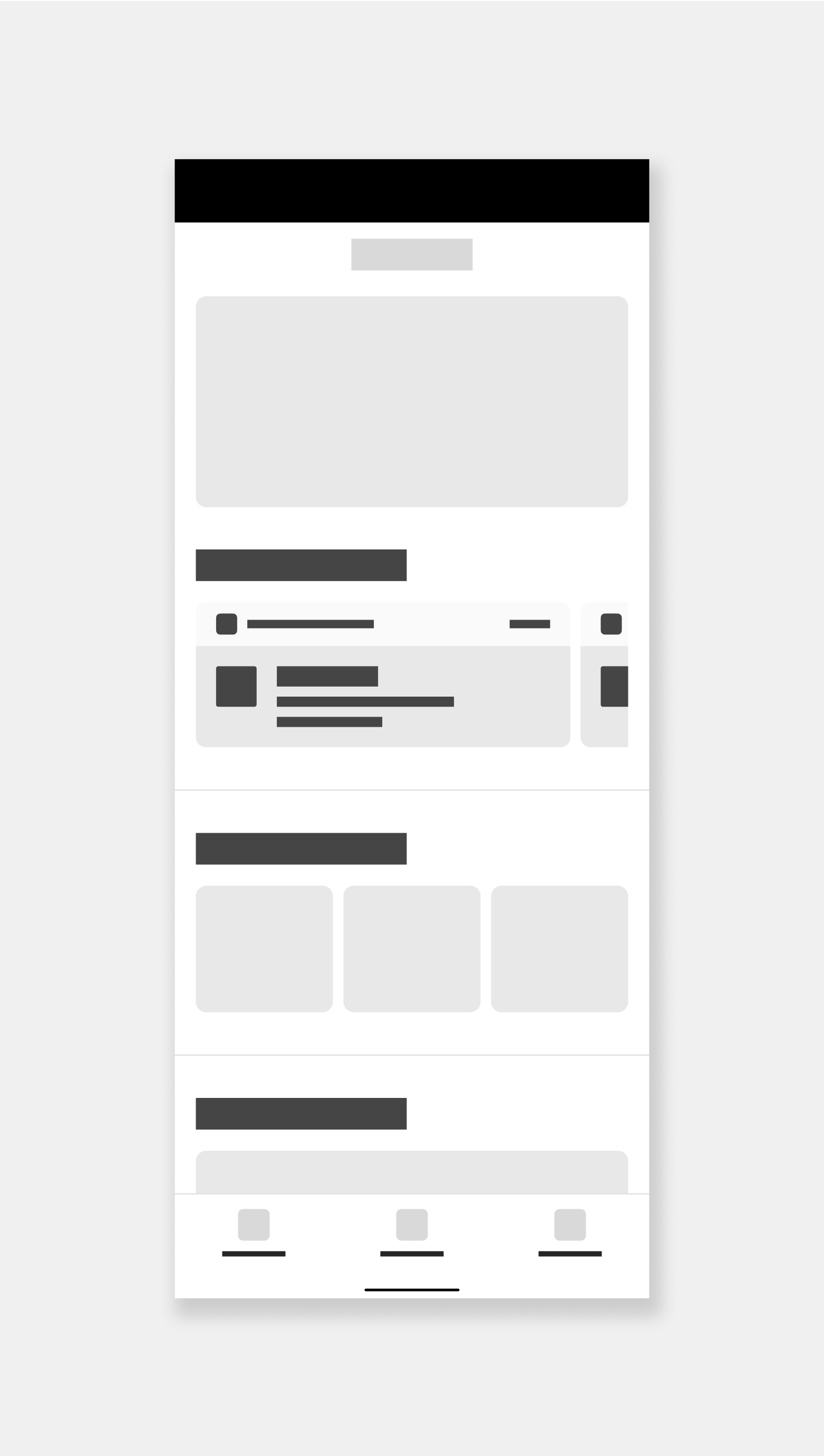
Dashboard pattern
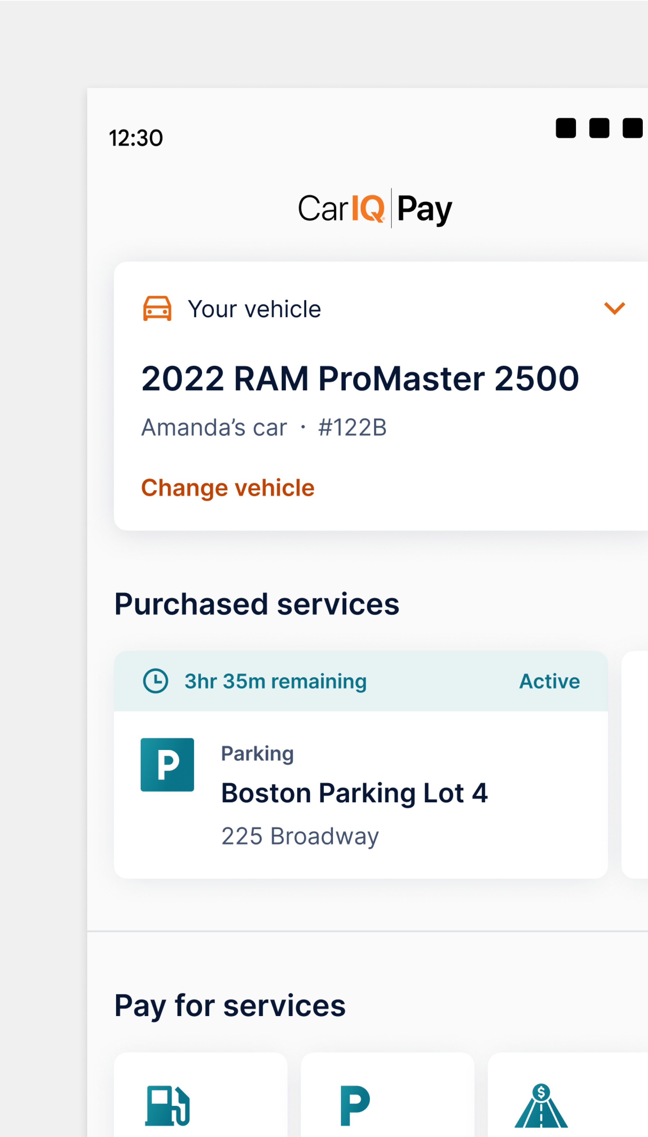
Dashboard screen
One united brand
Altogether, the updated visual style paired beautifully with Car IQ’s marketing and brand.

Car IQ website landing
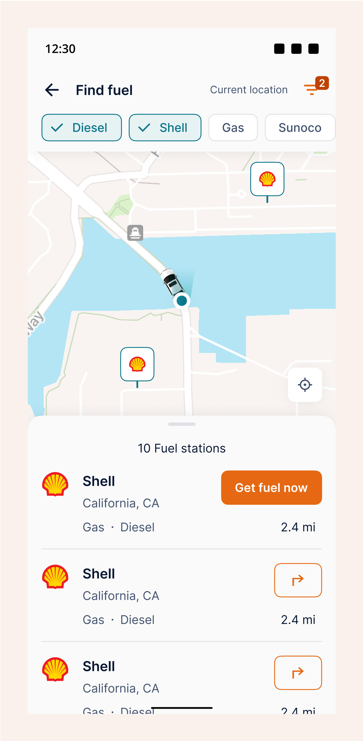
Find fuel screen
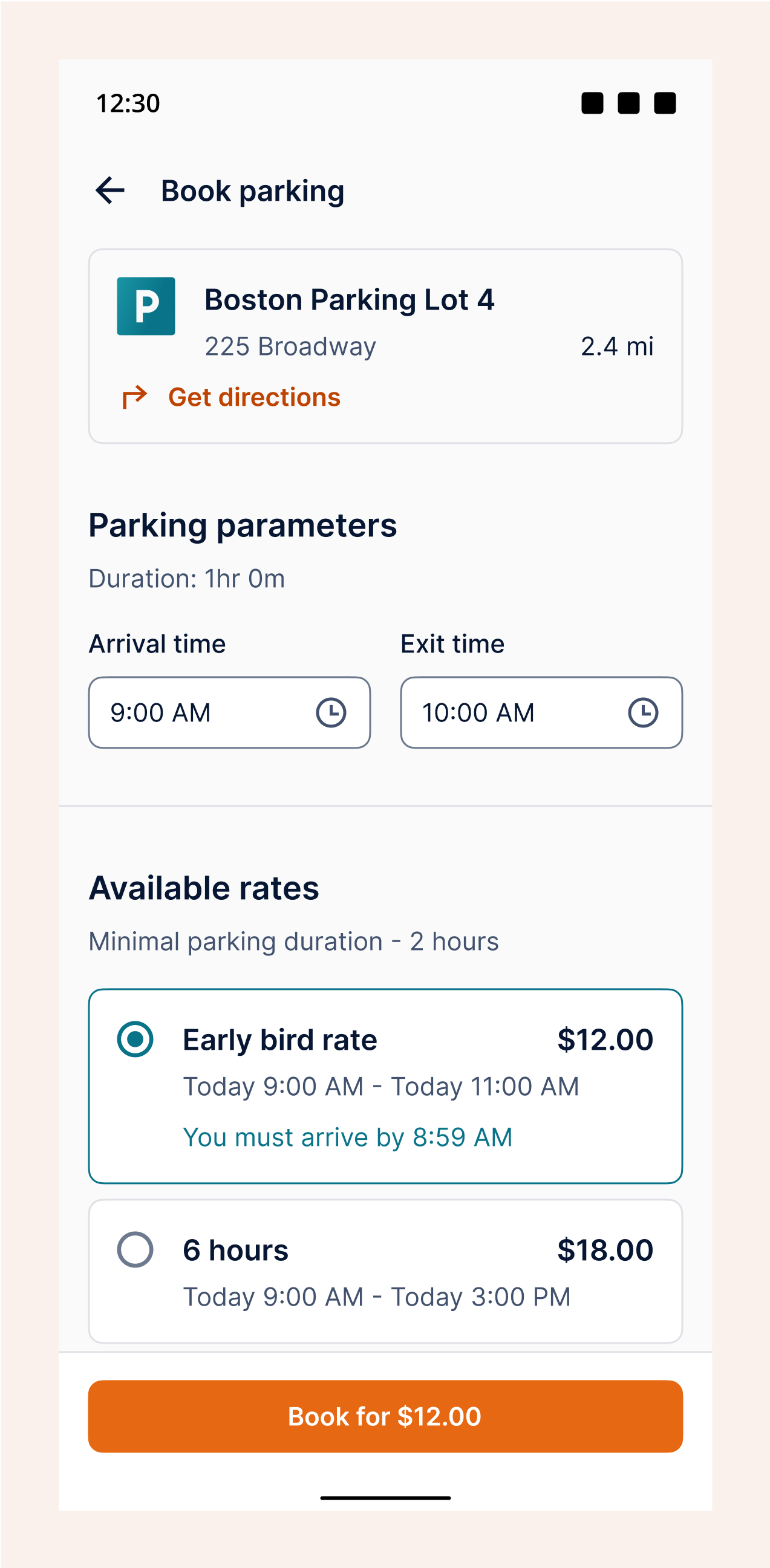
Book parking screen
Ensuring Collaboration, All Around
Archive
With designs changing at such a rapid pace in a startup environment, the team wanted a way to reference past designs, especially those earmarked for future features that wouldn’t be part of an MVP.
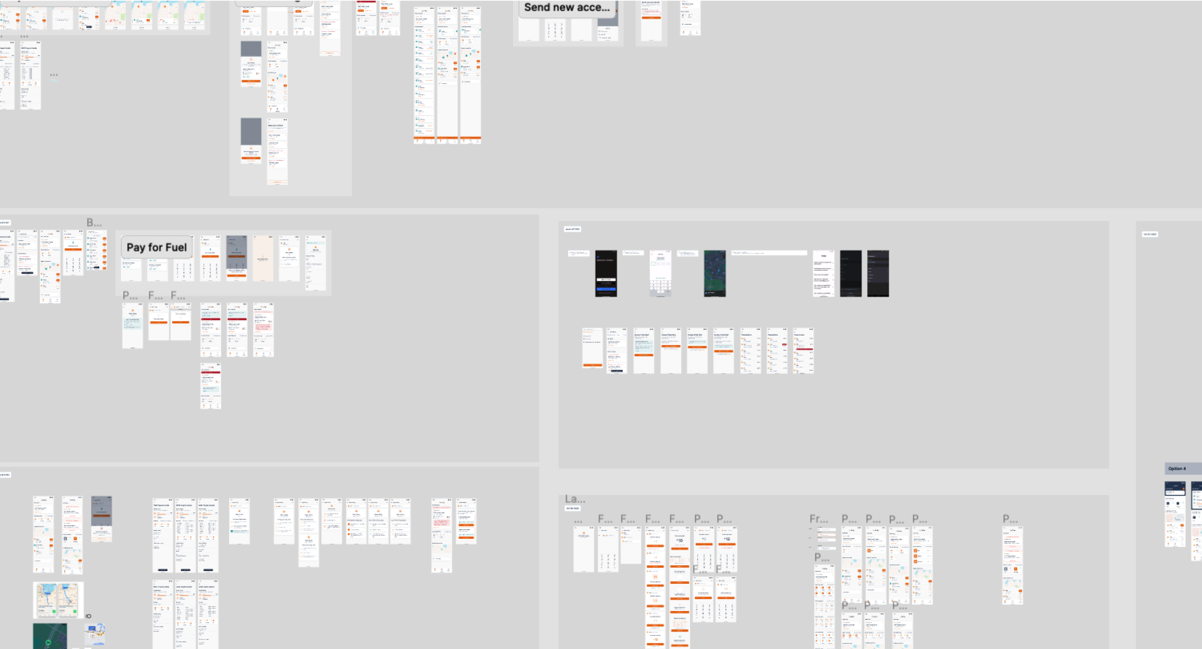
Car IQ archive
Demos
The product team often collaborated with Car IQ leadership and clients to pitch new features and show updates. These weren’t necessarily developed features but proof of concepts to advocate for product buy-ins.
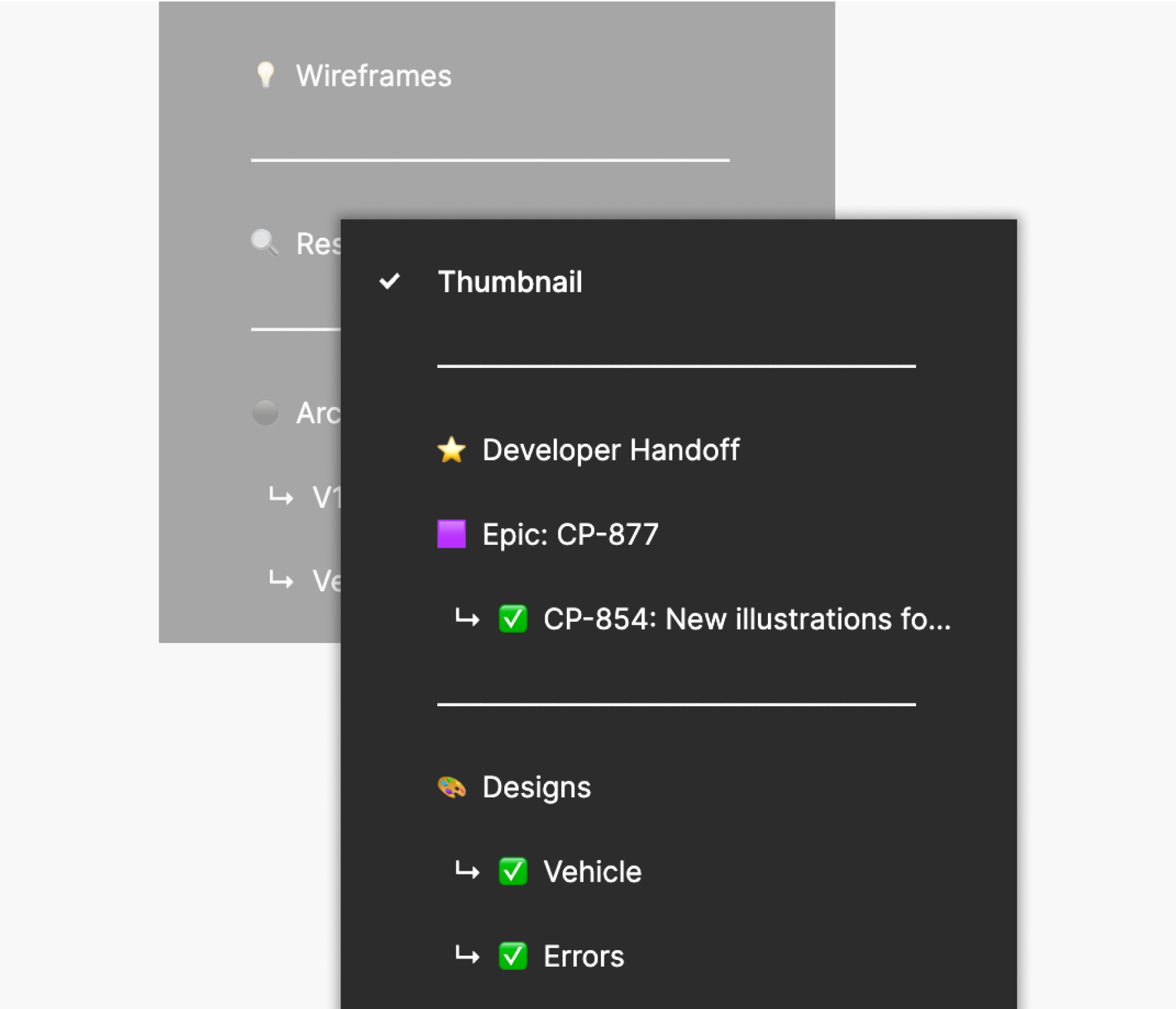
Development handoff organization
A new development handoff
A pressing issue at Car IQ was that product, design, and engineering teams had varying project timelines and team members were spread out across time zones, often with huge time differences. Updates to designs were getting lost in online communication.
The design system I put together made it apparent what designs were works in progress, currently implemented, in development, or reserved for a future development cycle, so developers knew which designs were ready to be built or still being worked on.
Impact
200+
Visual components and patterns
Instituting a robust system across the board made designing and developing much more efficient.
30+
Custom illustrations
Illustrations brought personality to Car IQ products, improving overall brand recognition.
Better team collaboration
A one-stop shop for Car IQ products allowed product managers, engineers, marketing, and other stakeholders to keep track of ongoing projects, reducing communication friction among the teams.
